-
Tutor/Teacher
-
- Assessment Settings
- Create a Section-wise Assessment
- Creating a proctored assessment.
- Creating a Random Assessment
- Creating an Adaptive Assessment
- Creating an Assessment
- Creating an Audio Question
- Creating Questions for Assessment.
- Download the Results
- Duplicate Assessment
- Evaluating attempts of Students
- Review questions of an assessment
- Review Student’s results and attempts
- Sharing Assessment URL
- Upload Questions using an Excel template
- Upload Questions using Word Template
- Show Remaining Articles (1) Collapse Articles
-
Student
-
- Answering Descriptive Questions
- Attempt Assessment using URL
- Attempt Fill In The Blank Question
- Attempting a Section-Adaptive Assessment
- Attempting an Assessment
- Attempting Coding Question
- Creating a proctored assessment.
- Creating an Adaptive Assessment
- Learning Assessment
- Review the results and get recommendations
-
Parent / Mentor
-
Publisher
-
- Assessment Settings
- Create a Section-wise Assessment
- Creating a proctored assessment.
- Creating a Random Assessment
- Creating an Adaptive Assessment
- Creating an Assessment
- Creating an Audio Question
- Creating Questions for Assessment.
- Duplicate Assessment
- Sharing Assessment URL
- Upload Questions using an Excel template
- Upload Questions using Word Template
-
Institute/Director
-
Admin
Dashboard
Under Dashboard, you will find details about the total of your publications and a detailed overview of subject distribution.
You will also find an analysis of trends and patterns in the content available on the platform.
Assuming that you’re already logged in, Click on Dashboard from the top panel.
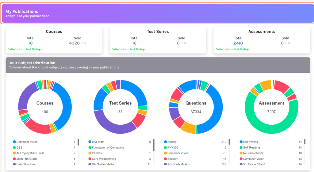
My Publications: overviews all the assessments, courses, and test series.
- Total: Displays the total count of published content under each category.
- Sold: Displays the total number of content sold under each category.
Your Subject Distribution: displays the distribution of different types of content under Courses, Test series, Questions, and Assessments attempted.
Each content is assigned a different color and made into a pie chart for better understanding.
You may refer to the color coding right below each chart.
The graph below shows the trend analysis of the content bought on respective dates.
The colored lines show which content was bought; the same can be referenced below the graph.
You may navigate between Course, Assessments, and Test Series (Refer to point 1)
You may also filter results in weekly analytics using the drop-down.
